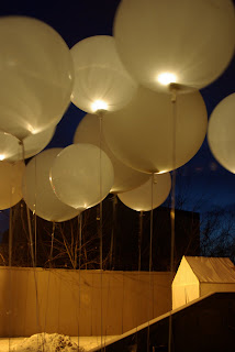
 Personally, when I think of winter colours I think of pastel tones. Colours like light pink, mint green, light blue-green, lavender and of course ice blue. There are of course other pastel tones like light orange and light yellow however, these colours evoke spring because of their warm orientations on the colour wheel. Pink is also a warm colour but it is an exception to this rule because it reminds us of the cherry candy canes and peppermints of Christmas time. When you use these colours with white and silver and sometimes pale gold tones they begin to take on a frosted look. Almost as if they were left outside and ice has begun to form on them. This is especially the case when you include glittery accents throughout the event.
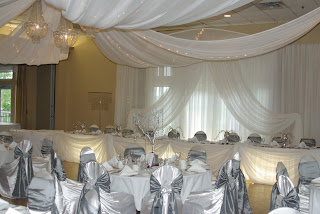
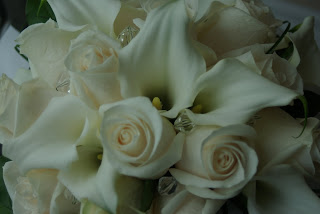
Picture a mostly white bouquet, with tiny blossoms in pink and white roses subtly dipped in pale-pink glitter. Pretty right? Perhaps even, a room with soft white and silver draping, throw in a few mint green crystal accents. Wouldn't that be a winter wonderland?


Although I always prefer colour, there is always the option of an all-white winter wedding. This can be equally as beautiful. When choosing an all-white wedding you have to be careful. A completely white event could easily become cold or boring, but the key to avoiding this is by incorporating different textures.
If you imagine for a second an all-white curtain backdrop. If you use the same fabric hung in the same way throughout, it sounds like it could be plain right? Well take that same backdrop, maybe add a section of ruched (gathered) satin in the centre, add some hanging crystal strands, a couple of tiny snowflakes and a couple of fabric swags. Immediately, that plain backdrop has become multi-dimensional and much more interesting. This same formula works for flowers. Rather than have a bouquet of a singular type of flower such as a rose, add hydrangea or calla lilies. Instantly the variety of textures becomes a completely different experience. For those of you who like simple, this might not apply to you. Just remember that things can be simple but not everything should be the same. I know it's cliche but, variety IS the spice of life. 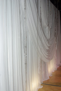
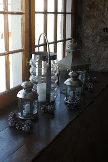
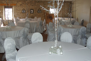


I hope that some of you out there find this post helpful.
- Rob

 Once you have chosen your core colour ask for a swatch of fabric. Usually you will
  Now let's go back to school and learn about pairing up complimentary colours. You may remember the colour wheel from art class. There is
 Tertiary colours are blue-purple, blue-green, yellow-green, yellow-orange, red-purple, red-orange:

 As long as you think about the compliments of colour you will succeed. A variety of shades adds depth, interest and warmth to your wedding.


